Crypto Convert Flow Revamp
Crypto Convert Flow Revamp
Revamping a crypto convert flow to improve the UI an overall experience for our users
Revamping a crypto convert flow to improve the UI an overall experience for our users

Role: Product Designer
Skills & Tools:
Figma: Flow mapping, Wireframing and Prototyping
Overview
Overview
Overview
We updated the crypto conversion feature to visually match the other products within the app. By improving the layout and removing unnecessary elements, we made it easier for users to navigate and complete their crypto conversion journey.
We updated the crypto conversion feature to visually match the other products within the app. By improving the layout and removing unnecessary elements, we made it easier for users to navigate and complete their crypto conversion journey.
Goals
Goals
Goals
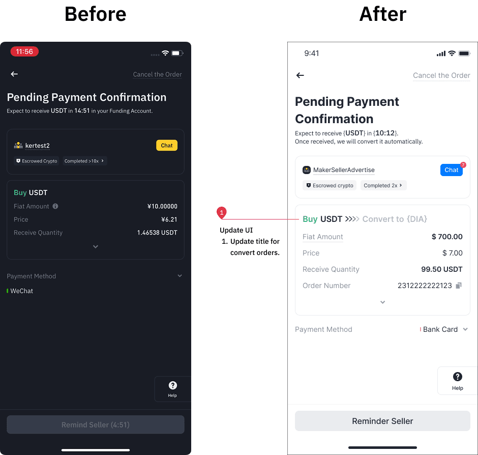
Update UI: UI was inconsistent with the other products within the app, giving users an inconsistent experience.
Reduce information: Poorly structured information confused and overloaded users.
Update user flow: Redundant steps affected user experience and reduced conversion rates.
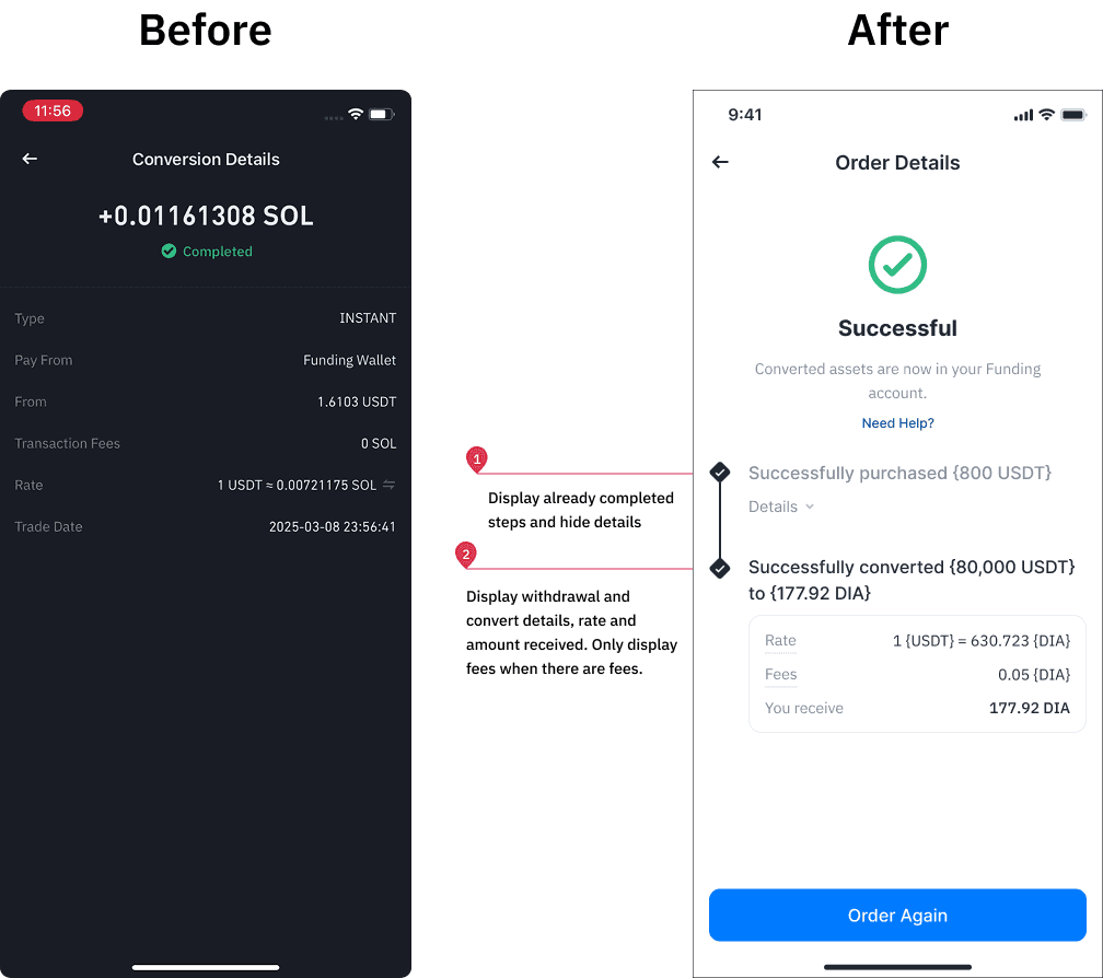
A before and after preview of the Convert Result screens.
A before and after preview of the Convert Result screens.
Challenges
Challenges
Challenges
The crypto conversion feature is a tool for users to exchange cryptocurrencies, but it suffered from outdated visuals, unclear information flow, and low adoption. This revamp was an opportunity to overhaul the UI, reorganize content, and streamline functionality to create a modern, user-friendly experience that encourages usage.
Outdated Visuals: The interface looked visually unappealing, with an old, clunky design that didn’t match the rest of the app’s look and feel.
Confusing Layout: Information was poorly structured, making it difficult for users to understand the conversion process at a glance.
Lack Of Visual Feedback and Inconsistencies: There was a big lack in visual feedback that informed users about the status of their conversion, and the old convert pages were handled by another team, which caused it to be inconsistent with our own product logic and visuals.
The Approach
Research & Insights
Analyzed User Behavior: Checked where people were getting stuck or abandoning the convert flow.
Looked at Competitors: Checked out how other major crypto platforms like OKX and MEXC handled similar conversion features. Looked at other similar financial products such as traditional bank apps for UI inspiration.
Talked to Stakeholders: Learned about what information was the most important to them at each step in the conversion flow, and what information was redundant.

Some of our references and research
Some of our references and research
Design Process
1. Modernizing the Look:
Typography & Colors: We updated the typography to make the key information pop (Successfully converted etc.)
Illustrations and components: We updated old illustrations, components and elements for a refreshed look that matched our crypto purchase flow as well as the rest of the app.
2. Simplifying the Flow:
Updating the Layout: Previously, there was no clear indication to users that they were in the convert flow, so we broke the process down into clear steps with proper titles and displayed convert-related information early on.
Organising Information: We grouped relevant details for easier information processing; the older pages were lacking in important information to users
Progressive Disclosure: We hid additional options and less important information under collapsible menus to keep things simple.
3. Information Clarity:
Important Information: Made sure important information such as fees were displayed upfront in a clear, easy-to-read format. We shifted less important information into the Order History details to reduce the amount of information that users need to process.
Status Indicators: Added more progress statuses so users always knew where they were in the convert process.


Some changes we made to improve information displayed to users.
Some changes we made to improve information displayed to users.
Receiving Feedback
We also tested multiple versions internally by sending out surveys and asking friends and family around us which versions they preferred and why. Using the feedback received, we tweaked things like button placements, information displayed and layout.
Receiving Feedback
We also tested multiple versions internally by sending out surveys and asking friends and family around us which versions they preferred and why. Using the feedback received, we tweaked things like button placements, information displayed and layout.
Results
More Conversions: People were able to complete their transactions with more clarity and speed.
Happy Users: Feedback from surveys showed that people found the new flow much easier and more enjoyable to use.
Easy to Understand Pages: Updating the UI to align with the rest of the app meant users could pick up the feature faster. Well organised details meant users could process important information at one glance.

New screens from the flow.
Please note: Illustrations, fonts and terms have been changed to avoid conflict.
New screens from the flow.
Please note: Illustrations, fonts and terms have been changed to avoid conflict.
Key Learnings
Key Learnings
Good Design Builds Trust: A modern, cohesive look made the feature feel more reliable.
Information Clarity is Crucial: Organizing content logically and using visual hierarchy makes complex processes feel simple and approachable.
Simplicity Wins: Cutting out unnecessary elements made the process feel less overwhelming.
Teamwork Matters: Collaborating early with stakeholders helped us make practical, impactful changes.