Upgrading Our Posting Process
@ Scratchbac
Upgrading Our Posting Process
@ Scratchbac
Upgrading and redesigning the posting flow to better suit our users and increase posting rates.
Upgrading and redesigning the posting flow to better suit our users and increase posting rates.

Overview
Overview
Scratchbac is a social app designed to reconnect you with people nearby, fostering a hyperlocal community. During the app’s redesign, we focused on reworking the posting flow to align better with our user base and improve content quality.
Scratchbac is a social app designed to reconnect you with people nearby, fostering a hyperlocal community. During the app’s redesign, we focused on reworking the posting flow to align better with our user base and improve content quality.
Role & Skills
Role & Skills
Product Designer
Market Research
Flow mapping
Wireframing
Prototyping
Iterating
Tools Used:
Figma
Notion
Product Designer
Market Research
Flow mapping
Wireframing
Prototyping
Iterating
Tools Used:
Figma
Notion
Challenge
Challenge
Our main goals and challenges were to:
Increase user engagement within the app.
Reduce complexity and achieve a lower barrier of entry for all users.
Create a more visually appealing app for users to enjoy.
Our main goals and challenges were to:
Increase user engagement within the app.
Reduce complexity and achieve a lower barrier of entry for all users.
Create a more visually appealing app for users to enjoy.
Old Posting Flow
Old Posting Flow
Challenges
Challenges
As Scratchbac’s usability and aesthetics improved, we noticed a decline in average session length and frequency, despite strong user retention and active user counts. Since Scratchbac thrives on user-generated content, the decrease in high-quality content posed a significant issue. While we could create a visually appealing app, it became clear that the real key to engaging users lay in enhancing content quality and increasing content frequency.
Our goal was to upgrade the posting system, making it easier for users to create high-quality content regularly, thereby solving the issue of content scarcity and quality.
Simplicity: The posting process needed to remain quick and intuitive, encouraging frequent use across a wide age range of users, from teens to seniors.
Accessibility: Ensuring the process was accessible to all users, regardless of their tech-savviness, was crucial.
Approach
Approach
Approach
1. Research and Analysis
We studied the posting systems of leading social media platforms like Twitter, Reddit, and Instagram, observing how their streamlined, distraction-free posting processes enabled users to generate content quickly and efficiently. Notably, these platforms also offered a “draft” function, which we lacked, allowing users to save posts in progress.
User feedback revealed that our old posting system was too complex and confusing, particularly for older users, leading to a high abandonment rate during the posting process.

One of our posting flow drafts
One of our posting flow drafts
2. Reviewing the Current System
Our original posting system required users to input a range of details before submitting a post. This complexity, coupled with visual clutter, created a high barrier to entry, particularly for less tech-savvy users. It was evident that simplifying the posting flow would reduce user frustration and encourage more content creation.
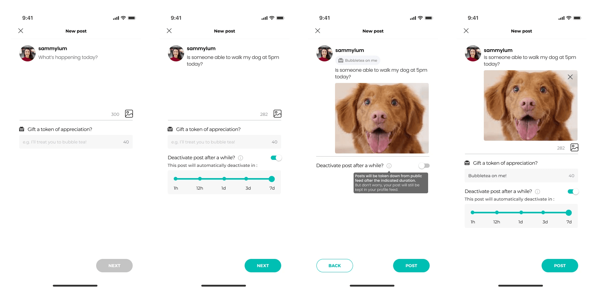
Posting 2.0 Prototype Frames
Posting 2.0 Prototype Frames
We also added a draft function for users to pop back anytime to continue the post they were working on. We get it, life gets in the way sometimes.
We also added a draft function for users to pop back anytime to continue the post they were working on. We get it, life gets in the way sometimes.
3. Ideation and Prototyping
To improve the user experience, we streamlined the posting process, removing unnecessary features and enhancing simplicity. We added easy access to the camera and photo album to encourage visual content and introduced a location-tagging feature to promote connections within local communities.
We released an interim prototype, Posting 2.0, while continuing to refine the design.
Results
Results
Reviewing Posting 2.0
Post-launch feedback from power users was generally positive. They appreciated the more direct posting experience, and the built-in camera feature saw high engagement. The location tagging feature, though unfamiliar to some, was well-received after initial use.
We observed an uptick in the number of posts, including a marked increase in posts featuring pictures and videos. The feed became more visually engaging, with users sharing photos of their surroundings, contributing to a more dynamic and vibrant community.
Iteration – From 2.0 to 3.0
Iteration – From 2.0 to 3.0
Based on user feedback, we set out to further refine the posting system. Our focus was on making posting feel more natural while encouraging higher-quality media posts. We studied popular platforms like Instagram and Twitter to map user journeys and applied these insights to our app.
A key insight was that users found the in-app camera function crucial for motivating media posts. To accommodate this, we redesigned the interface, placing the camera button at the center of the screen and making media previews larger.

User Journeys
User Journeys

3.0 draft
3.0 Posting Draft
Launching Posting 3.0
Launching Posting 3.0
After implementing these refinements, Posting 3.0 was ready for release. The system was streamlined further, with reduced visual clutter and a clearer focus on enabling quick and easy media sharing.
After implementing these refinements, Posting 3.0 was ready for release. The system was streamlined further, with reduced visual clutter and a clearer focus on enabling quick and easy media sharing.
3.0 Version of Scratchbac's Posting featuring Dark Mode!
3.0 Version of Scratchbac's Posting featuring Dark Mode!
Key Learnings
Key Learnings
User-Centric Design: Simplifying the posting process was key to improving engagement. By making the app intuitive and accessible, we catered to users across a wide age range, enhancing the overall user experience.
Small Changes, Big Impact: Even seemingly minor tweaks, like adjusting button size and location, had a significant impact on user behavior.
Content Quality Boost: By focusing on effortless posting, we encouraged users to share more high-quality content, resulting in a more vibrant and engaging feed.
Continuous Iteration: Listening to users and iterating based on their feedback was crucial in creating a posting flow that met their needs while boosting key user metrics.