Property Listing Flow @ Turnkey
Property Listing Flow @ Turnkey
Creating a flow for users to market their local real estate.
Creating a flow for users to market their local real estate.
Role: Product Designer
Skills & Tools:
Figma: Flow mapping, Wireframing and Prototyping
Overview
Overview
Overview
TurnKey is a real estate marketplace app built to simplify users' buying and selling process while helping them save on costs. As part of this project, I redesigned the property listing flow, focusing on enhancing the app’s visual appeal and establishing a professional, trustworthy brand experience.
A passion project, TurnKey is a real estate marketplace app that aims to save cost for users looking to buy or sell their properties. I redesigned the property listing flow to improve the overall look and to create a more professional feel to it.
A passion project, TurnKey is a real estate marketplace app that aims to save cost for users looking to buy or sell their properties. I redesigned the property listing flow to improve the overall look and to create a more professional feel to it.
Challenge
Challenge
Challenge
The app’s original design felt outdated, and the founders were concerned it might hinder user trust and adoption. This redesign aimed to:
Establish a professional, timeless aesthetic that instills user confidence.
Create a comprehensive listing flow that supports the full customer journey.
Set a foundational UI standard for future app features and updates.

The Problem
The app’s property listing flow felt outdated, and the team worried it might turn users away. Key hurdles included:
Dated Aesthetic: The design lacked professionalism, making the app feel less credible.
Incomplete Journey: Critical screens and states (like error handling or feedback) were missing, leaving incomplete user flows.
Scalability Issues: Without a modular design system, future updates would be slow and inconsistent.
My Approach
Research & Insights
With limited time for deep research, we focused on quick, collaborative solutions:
Team Alignment: Ran a workshop with stakeholders to define a shared vision for the app’s visual style.
User Flow Audit: Mapped out the existing journey to pinpoint gaps, like missing error messages or abrupt login prompts.
Competitive Inspiration: Borrowed best practices from leading real estate platforms to ensure familiarity and ease of use.

Our Approach
We tackled the redesign with three core priorities:
1. Crafting a Timeless Look:
Clean & Professional: Used proper brand colours, crisp typography, and clean shapes to create a polished, trustworthy vibe.
Visual Feedback: Added real-time updates and error states to reassure users their progress was secure and aid them in the listing process.
2. Building Modular Components:
Reusable Design System: Created buttons, cards, and forms that could be easily reused across the app.
Consistency First: Ensured every element—from error messages to success screens—felt part of the same family.
3. Simplifying the Journey:
Guided Steps: Broke the listing process into clear stages: Details → Visuals → Pricing → Preview → Publish.
Error Prevention: Added inline validation and tooltips to help users fix mistakes before submitting.

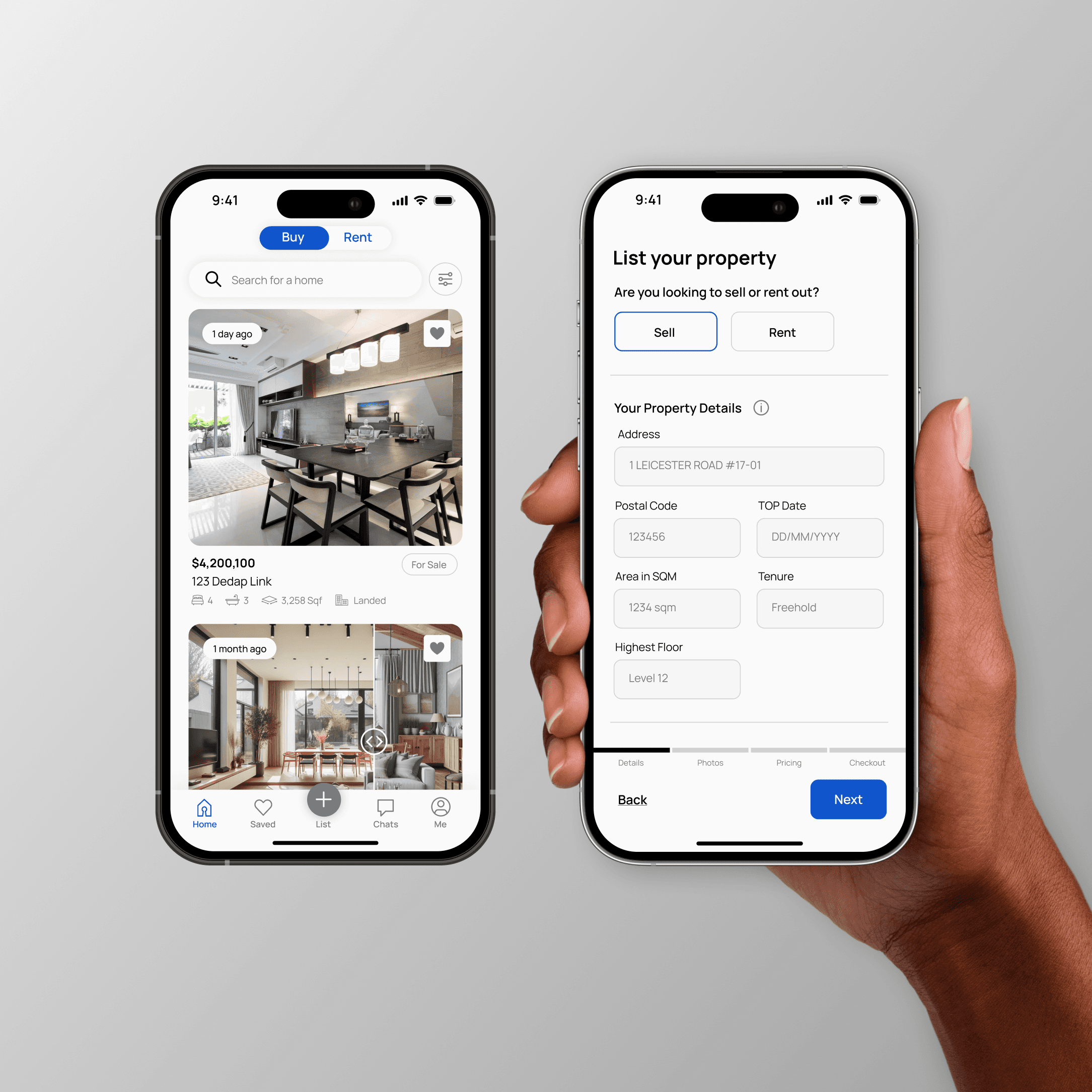
Key Changes
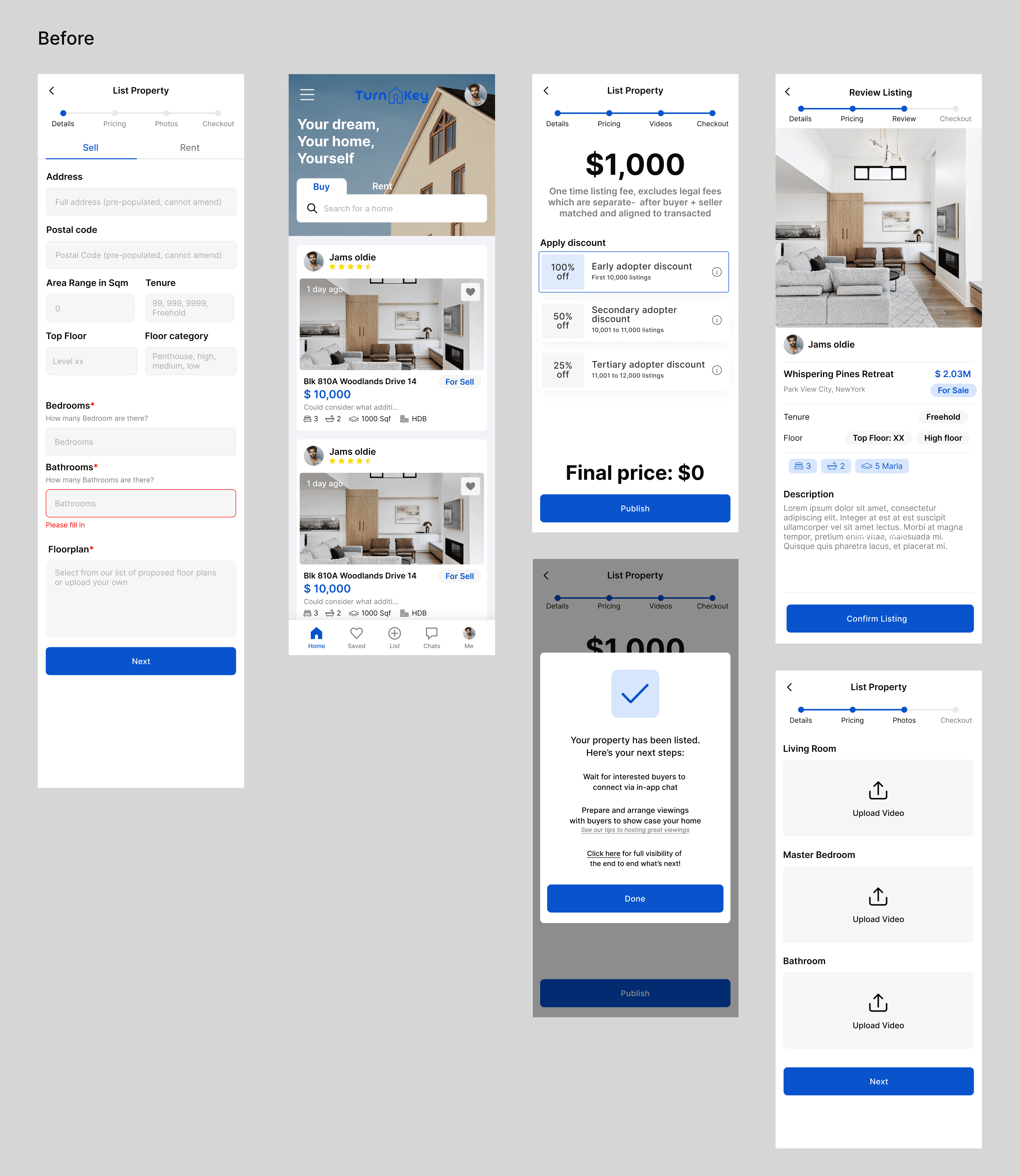
Before: The old flow felt disjointed, with abrupt transitions and unclear next steps.
After: A visually cohesive journey that guides users from start to finish.
We also introduced new screens for critical moments, like friendly error messages and confirmation modals, to reduce frustration.
Before: The old flow felt disjointed, with abrupt transitions and unclear next steps.
After: A visually cohesive journey that guides users from start to finish.
We also introduced new screens for critical moments, like friendly error messages and confirmation modals, to reduce frustration.
The Results
Though the app hasn’t launched yet, the redesign has already received positive feedback:
Team Excitement: Stakeholders praised the fresh, professional look, calling it a “massive upgrade.”
User Testing Wins: Early feedback from personal networks highlighted the flow’s intuitiveness, with one tester saying it felt “reliable and modern.”
Future-Proof Foundation: The modular system set the stage for faster, consistent updates down the line.
The video above is a preview of the new look and prototype! It's not the final and most comprehensive video (because the size was too big) but it's to show everyone what it looks like in action!
The video above is a preview of the new look and prototype! It's not the final and most comprehensive video (because the size was too big) but it's to show everyone what it looks like in action!
Key Learnings
Key Learnings
Clarity Over Complexity: Even small tweaks, like better error messages, can drastically improve user confidence.
Design Systems Save Time: Building reusable components upfront pays off—especially when you’re the only designer.
First Impressions Matter: A polished UI doesn’t just look good—it makes users want to engage.